1. The Solomon R. Guggenheim Museum
2. The Emil Bach House
3. The Imperial Hotel
4. Johnson Wax Headquarters

This picture shows the tower that towers (no pun intended) over the rest of the Headquarters.

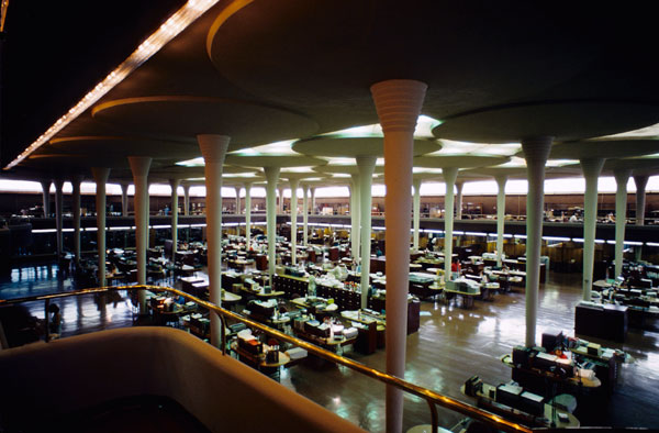
This is a picture of the "Great Workroom" (as Wright called it) were all the secretaries worked
This work utilizes streamlined building. Examples of this are shown in the rounded tower edges, and the curves all over the building. The Headquarters has over 2,000 kinds of curved red bricks decorating the outside and inside of the building. The two main colors for the Headquarters are red and cream. The outside of the Headquarters has mostly red on it, but in the parking garage, and the "Great Workroom" and elsewhere in the building the mortar and all the pillars are cream. A lot of the floor is also red.
The pillars shown in the picture above are like most of the other pillars in the building being dendriform (formed like a tree). Pyrex glass tubing is used in the roof and windows.
The Headquarters layout was built first, and later the tower. Johnson, (the owner of the Headquarters) really liked the Headquarters, so had the tower built, and then had a home built for himself that used the same material as the Headquarters. The tower is no longer used because of fire safety rules.
The building is entered through the parking lot/garage. The parking garage is supported by the same pillars as the "Great Workroom", but is low, so when you walk into the "Great Workroom" that is two stories tall it really seems open and large.
Wright designed the furniture for the building like usual, but Johnson did not like the chairs. They had three legs, so, Wright reasoned, you would have good posture, having to sit with both feet on the chair at all times. Johnson supposedly asked Wright to sit in one, and when he fell down, agreed to design new ones.
No comments:
Post a Comment